Elevating Employee Experience at Coca-Cola Through Service Design
Understanding the global data system and user needs to create solutions that drive self-service.
Following the success of launching ‘SIMON’ globally (Coca-Cola’s ‘#1 knowledge management and analytics solution), there was a large influx of content to be featured in the platform. These solutions had been developed by different teams resulting in a fragmented approach to design and user experience.
Establishing a design system enabled us to create a cohesive user experience which improved clarity and comprehension of data and reporting, strengthened the SIMON brand and improved efficiency in report creation.
Role:
UX Design & Content Strategist, UX Research, Change Management
Timings:
September 2023 - February 2024
Tools:
1x UX Designer, 2x UX Researcher, 2x Power BI Developers
Team:
Miro, Figma, Power BI
The challenge was greater than design inconsistencies alone
One of the problems we faced was inconsistent styling, which is common to many products that have been developed without a design system. However, we also faced the complexity of working with business reporting/data visualisations and Power BI:
Confusing navigation - reports lacked a clear hierarchy and there was no clear user flow.
Interactions, controls and rules differed between reports.
Limitations to what can be built within Power BI vs functionality of the report.
Our developers are not designers - Power BI developers were focused on data accuracy over consistent design.
Strategy
Take the leading industry standards for data visualisation and business reporting, combine these with Coca-Cola’s unique way of working, and apply web conventions to our SIMON Power BI reports to create a design system that corresponds with our users’ mental models, and creates a consistent experience, no matter which report they are viewing.
Research
Heuristic Analysis
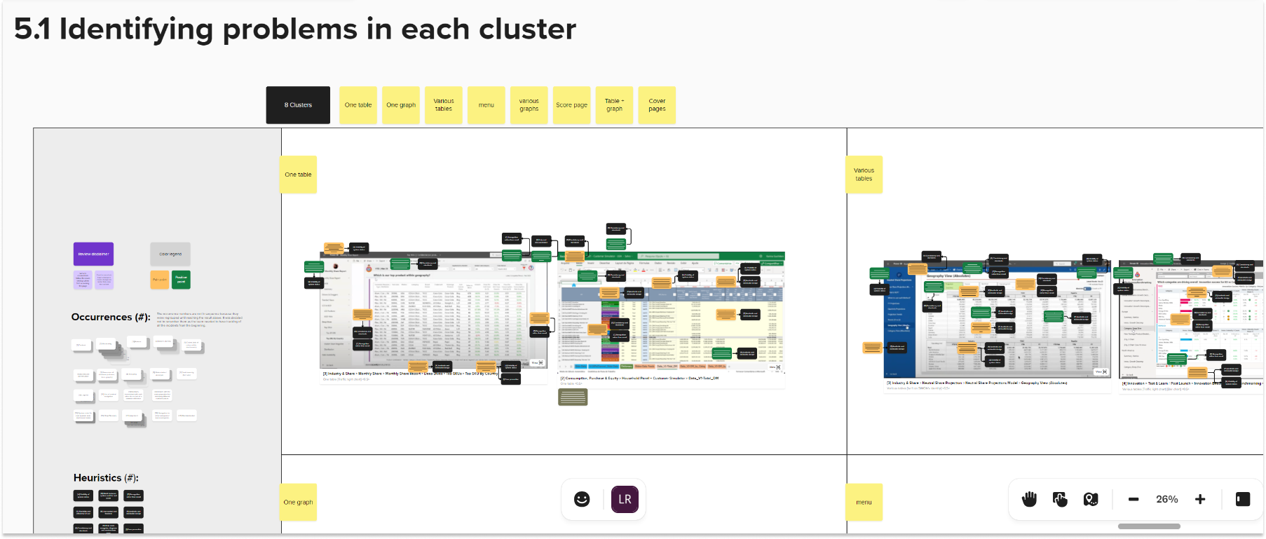
Firstly, we want to identify the possible problems with our reports and the severity. Using Jakob Nielsen's 10 Usability Heuristics, the team analysed 32 dashboards (over 300 pages!) to understand the main pain points that should be revised and to identify any positive uses of design/features.
The pages were clustered into 8 groups to understand the most common types of pages, charts and features that would need to be standardised. This also allowed us to prioritise which reports would be used for the usability testing.
Usability Testing
We then spoke to colleagues from across the organisation (I interviewed and a UX researcher took notes and assisted). I interviewed a mix of users and non-users of SIMON, from 9 different countries.
We observed their interactions with the reports, tested our hypothesis around the most critical pain points & themes, and identified any new problems.
5 main pain points were highlighted:
Navigation - so many options, so little time.
Confusing nomenclature.
Design standardisation (or lack of!)
Inconsistent functionality.
No feedback and limited perceivability.

Outputs from the usability test noting user questions, comments and pain points. [Blurred for confidentiality].
Design Audit
Based on the Heuristic analysis and the usability tests the highest impact issue was the inconsistent use of data filters/slicers and navigation buttons & menus.
The team reviewed each of the 300 pages again and noted the use of the different filters and buttons; including the naming conventions (nomenclature), functionality and types used.
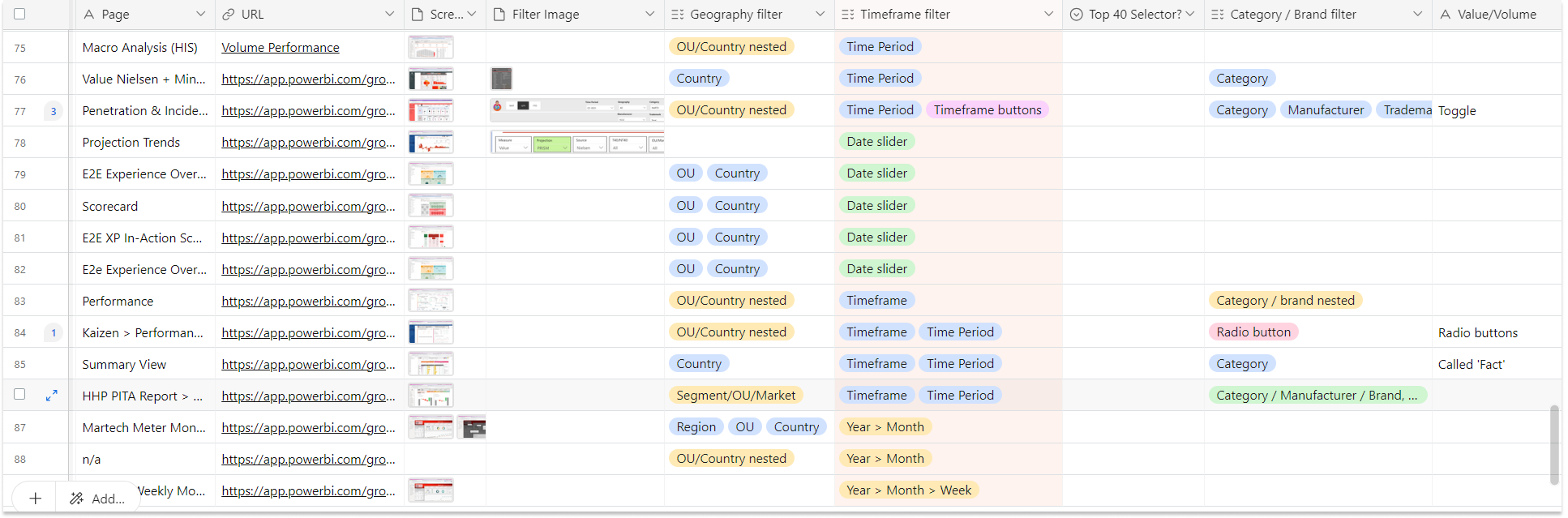
We logged the different types of data filters used on 30 reports; capturing the design, noting naming conventions, functionality and type of slicer/button/element.
We found over 70 different data filters (!)
In 30 reports we found 3 common filters, 8 fairly regular filters and 65 report specific data filters and naming conventions. We found endless amount of varying design in the use of buttons, toggles, dropdowns and radio buttons.
And not only that, there was very limited consistency in the placement of these page elements meaning the user found it difficult to know where to go next and our data was not telling a story.
Company:
Coca-Cola
The Solution

Building a Colour Palette
I wanted to create an accessible and legible colour palette and create rules to ensure consistency of colour usage across various data categories or groupings.
We used the existing SIMON brand colour palette as a base and created different accents/shades from each of the base colours. This allowed for a large and versatile enough palette that no other colours should be used.
The SIMON brand colours are intentionally bold, playful and unlike any other Coca-Cola brand colours. We wanted our reporting to stick out from the crowd and be unlike traditional corporate business reporting.
Documentation for Developers
We now had a comprehensive document outlining the new design rules; however, we faced the challenge that many of our Power BI developers were numbers-driven analysts and not designers.
Therefore, we built all the new components, colour schemes, charts & visualisations, and rules into a Power BI file to be used as a template.

Increased Accessibility
We tested all colours and shades using accessibility checkers to ensure that all users can interact with and understand our data.
The use of Red and Green is particularly important as these colours convey meaning quickly in business reporting. To ensure legibility of our chosen red and green we supplemented these colours with icons (arrows, ‘+’, ‘-‘) to effectively communicate the importance of these data points.
I received push back from stakeholders when suggesting we change the fundamental colour scheme. We ran all the previously used colours thorough the accessibility checker and almost all of the colours failed. This convinced stakeholders that changing the colour palette was beneficial to our users.
We also looked at average screen sizes used within the company and uses of mobile to assess the minimum font sizes for legibility.
”'Before' image shows a mock-up of the previous design; green text is not legible against the background colour, no indicator of positive or negative and illegible font size. 'After' image shows a mock up of the new design; correct use of space and descriptive titles and accessible green font with '+' indicator. *Data points are illustrative”

Visual Hierarchy (Nav & Buttons)
Our Design Audit had provided us with a large list of components that were used. Often a different component was being used for the same purpose, which was overwhelming and confusing for the user.
I simplified the use of components by restricting usage to buttons (no radio buttons, toggles, other native Power BI option, etc). I used 3 different types of buttons to create a clear visual hierarchy, allowing developers to create dynamic, multi-layered reports, whilst allowing users to understand which information should be reviewed first.
Main navigational elements were fixed to the top of the page, allowing users to control reports consistently and creating a link to the SIMON website/home page for increased movement between different SIMON solutions and report specific help in one click.

The Results
01
Improved clarity and comprehension of complex data
In a recent survey 74% of SIMON users said "SIMON helps me to understand business performance", a +14% increase vs. the previous year.
02
Strengthening the SIMON brand
The design standards mean that the SIMON brand has further reach and recognition across the organisation and users have increased by 45% vs. previous year to almost 5000 (H1 2024).
03
Efficiency in report creation
The template means developers can learn as they build. We can ensure that the team are using the latest version, and it saves the teams considerable time when creating new reports and onboarding new developers.
04
Easily adaptable, scalable design system
The design system is scalable and can easily adapt to new data, metrics, and reporting needs.
It has the flexibility to accommodate growth and business changes without major redesigns.
More Projects
-
![]()
Dream it.
-
![]()
Build it.
-
![]()
Grow it.
-
![]()
Sell it.